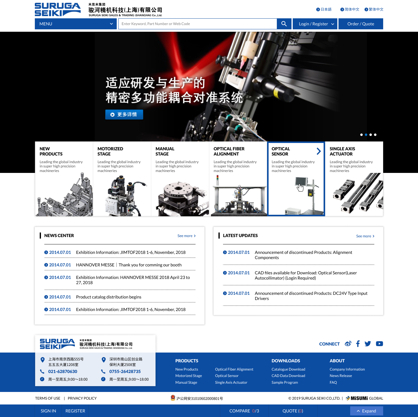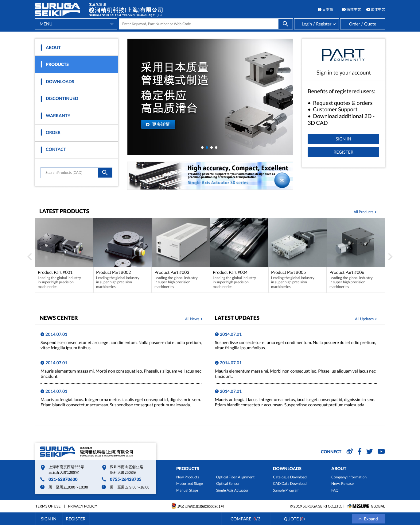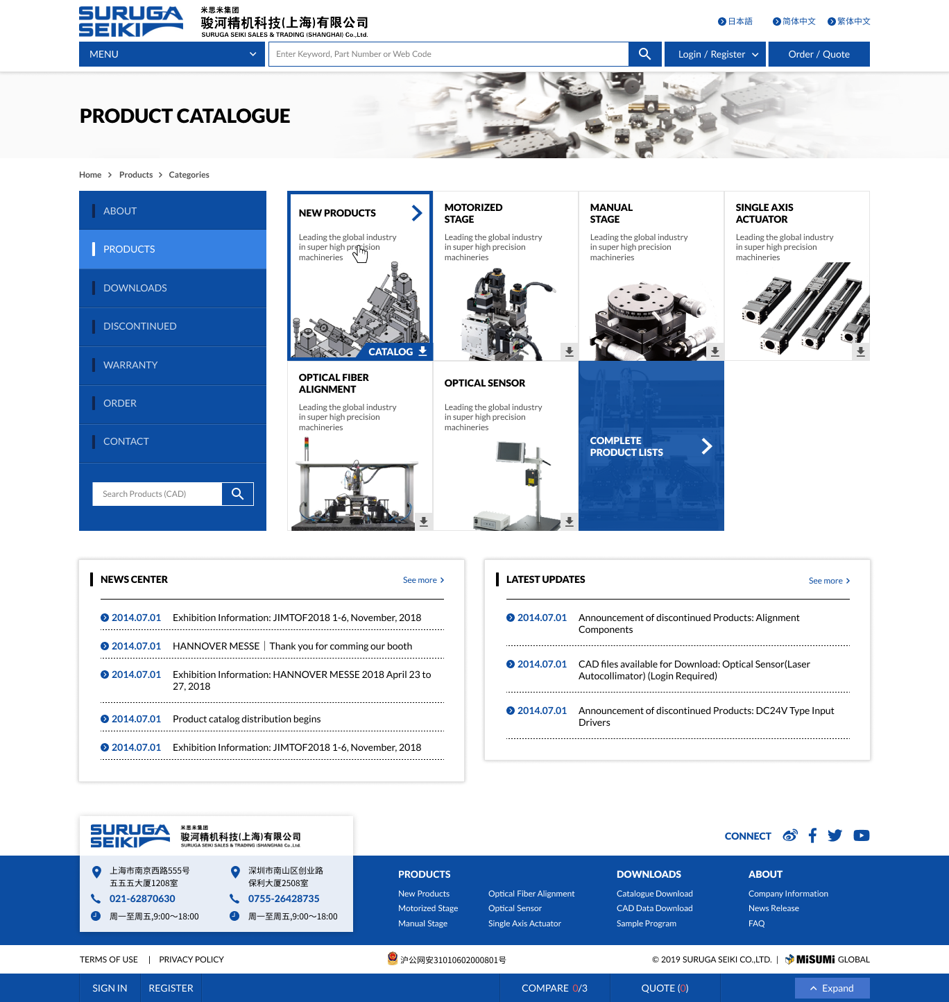
This project aims to improve the user experience (UX) and user interface (UI) of the SURUGA SEIKI CO.,LTD. a leading manufacturer of mechanical parts, while maintaining the original look & feel of the original brand identity. The redesign will focus on enhancing navigation, accessibility, and visual appeal, while ensuring a seamless transition from the existing site.
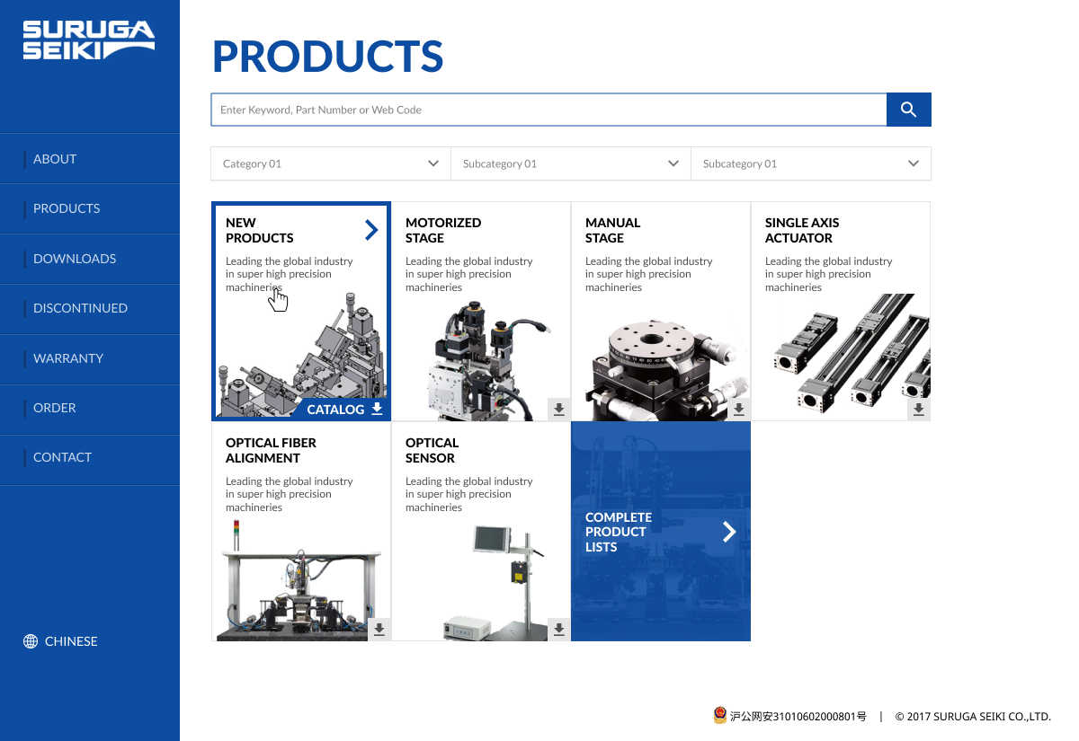
First let’s take a look at the original website. Most Japanese companies who’s been operating for several decades have old, outdated websites but this one doesn’t look too bad. It was last updated in 2017 after all.
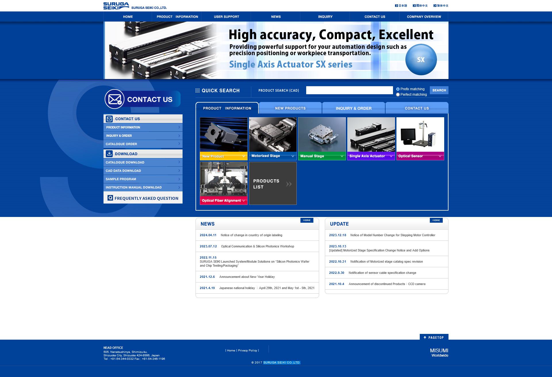
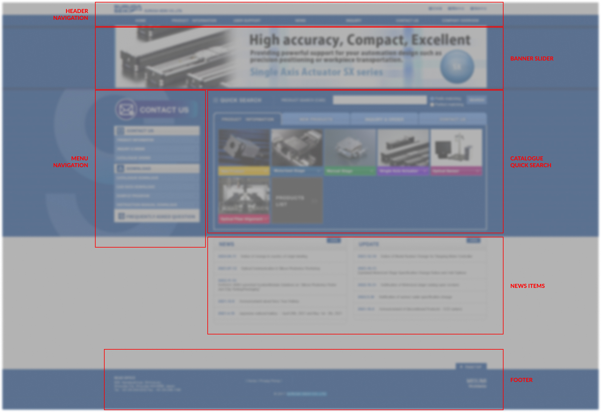
This client follows the traditional Japanese design approach, that is ‘incremental improvement, no major deviation from the original design’. So our first order of business is to identify the elements on the homepage to keep.
With that in mind, we get to design a couple of variations
Of course, as a website in 2020, we cannot forget it needs to be fully responsive.
